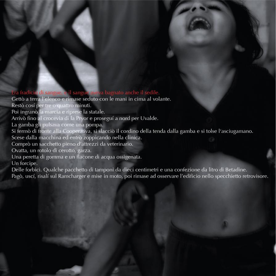
No Country for Old Men comes from the graphic design services of a photograph taken in Sicily in July 2012, with a small Romany subject in motion. It is part of the series Journal / Newspaper. The form of the work is square, the subject has decentralized the right side, the chin of the child, raised, creates an interesting perspective foreshortening. The rapid pace of the subject toward the target gives a slight dynamic image. The choice of the reduced color range is typical of the entire series: white, black, red and gray scale recall a tri-color that moves along the black / white with the addition of only red. Ancient chromatic agreement, effective and, at the same time, contemporary. The paragraph as a kind of caption journal is a literary quote cross. The fact that the meaning of the writing is not compatible with what we suggest the image creates a sense of visual disorientation and cognitive incompleteness. Like the concept of saboteur quiet Magritte, I elimiato connections between words and figures. The original idea for the series was shooting, the image graphically create and place an excerpt from a graphic novel with-pedantic. I have focused on the effectiveness visual, chromatic and lettering, as autonomous elements, to create a simultaneous equilbrium of different entities.
News
celeste,


Comments 0
Say something