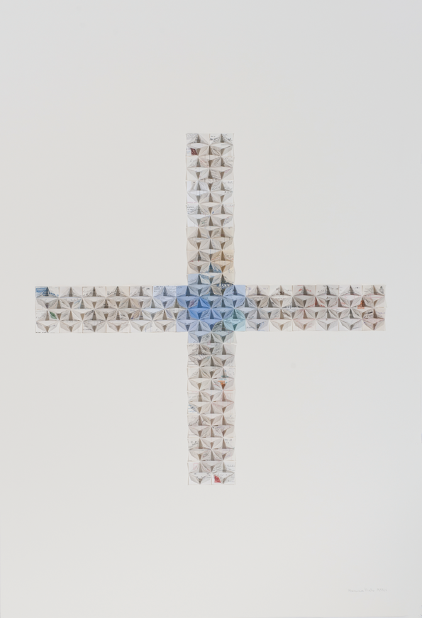
COMPOSITION NO.6: A HORIZONTAL & A VERTICAL LINE
Composition No.6 holds perhaps the strongest associations of Francisca’s linear symbols, yet she draws our eyes away from recognition by directing our gaze to the point where the two lines meet. The colours of these beautiful and discarded receipts* deepen as they reach the centre; the change is subtle, growing with energy through the delicate graduation of paper tones. Such details are long forgotten in our digital world of email confirmations and till receipts but Francisca’s folds pause to remember the historical additions – revealing emblems of old companies, signatures and the iconic index or printer’s fist.
- Artwork from the ‘Underlined’ series, where in eight compositions Francisca presents ‘The Line’, freeing its form from context and exploring its intrinsic significance-
http://www.blankproject.co.uk/series/underlined
* Material: A collection of old receipts from the 19th and 20th century.
Image of detail: http://www.celesteprize.com/artwork/ido:386207/


Comments 0
Say something